Office UI Fabric responsive grid: breakpoints, push/pull and other available classes
This post is over a year old, some of this information may be out of date.
At the moment the documentation for Office UI Fabric is focussed on Office Add-ins. For example: if you check the grid styles, there is mentioned that there are utility classes for small, medium and large devices, but there is more functionality hidden inside the SASS/CSS files. In this article I will describe a couple of very useful CSS classes which you can use when building your own applications with the Office UI Fabric framework.
Note: styles documentation - http://dev.office.com/fabric/styles
UI Fabric Media Queries / screen breakpoints
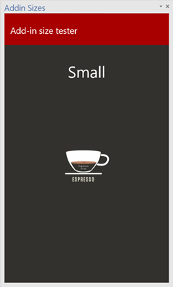
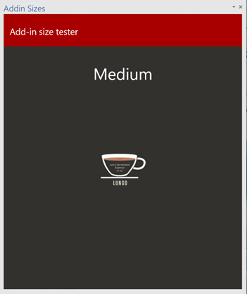
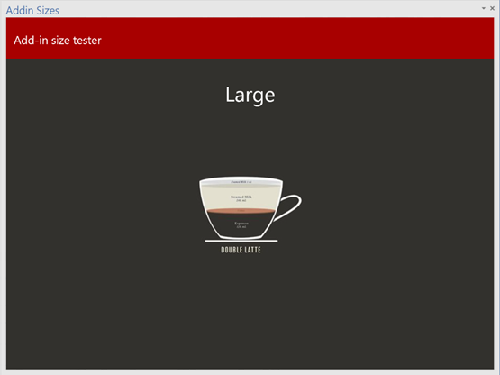
First are the media queries or screen breakpoints. In the documentation you find that there are three main targets: small, medium, and large. These sizes can also be used in your Office add-ins. Here is an example of the add-in sizes when you resize the canvas:
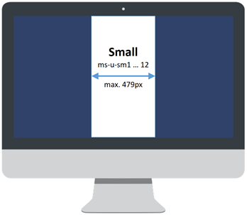
Small - ms-u-sm1 … 12
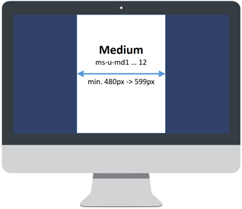
Medium - ms-u-md1 … 12
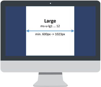
Large - ms-u-lg1 … 12
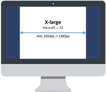
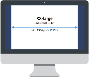
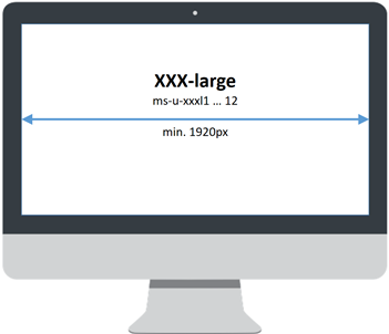
When you dive into the SASS or CSS from Office UI Fabric, you can notice that there are defined more media queries and utility classes. These other screen breakpoints and utility classes could come in handy when you are creating web applications. Here you can see which media query breakpoints are available:
Small
Medium
Large
X-Large
XX-Large
XXX-Large
Hiding elements via visibility classes
Like in Bootstrap and other frameworks, UI Fabric has also classes to toggle when content needs to be visible and when it needs to be hidden. There are a couple of useful utility classes for this.
| **Small** | **Medium** | **Large** | **X-Large** | **XX-Large** | **XXX-Large** | |
| .ms-u-hiddenSm | **hidden** | visible | visible | visible | visible | visible |
| .ms-u-hiddenMd | visible | **hidden** | visible | visible | visible | visible |
| .ms-u-hiddenLg | visible | visible | **hidden** | visible | visible | visible |
| .ms-u-hiddenXl | visible | visible | visible | **hidden** | visible | visible |
| .ms-u-hiddenXxl | visible | visible | visible | visible | **hidden** | visible |
| .ms-u-hiddenXxxl | visible | visible | visible | visible | visible | **hidden** |
| . ms-u-hiddenMdDown | **hidden** | **hidden** | visible | visible | visible | visible |
| .ms-u-hiddenLgDown | **hidden** | **hidden** | **hidden** | visible | visible | visible |
| .ms-u-hiddenXlDown | **hidden** | **hidden** | **hidden** | **hidden** | visible | visible |
| .ms-u-hiddenXxlDown | **hidden** | **hidden** | **hidden** | **hidden** | **hidden** | visible |
| .ms-u-hiddenMdUp | visible | **hidden** | **hidden** | **hidden** | **hidden** | **hidden** |
| .ms-u-hiddenLgUp | visible | visible | **hidden** | **hidden** | **hidden** | **hidden** |
| .ms-u-hiddenXlUp | visible | visible | visible | **hidden** | **hidden** | **hidden** |
| .ms-u-hiddenXxlUp | visible | visible | visible | visible | **hidden** | **hidden** |
Column ordering via pull, push and reset
Pulling or pushing elements is something that is also described in the Office UI Fabric documentation. With the pull and push utility classes, you are able to reorder elements on your screen based on the screen sizes. This is useful when you have an element which is important and has to be pulled upwards when you are working on a small screen device. In a more complex grid scenario it could be that you want to push an element upwards on a small screen device, and push it downwards on a bigger version. This could require to make use of multiple push or pull utility classes. When this is the case, you will have to reset your push or pulls on the element.
Push classes and reset
Pushing: .ms-u-*Push1 … 12
Reset: .ms-u-*Push0
Important:** you will have to replace the ”*” star in the pushing and reset classes. You can replace them with: sm, md, lg, xl, xxl, or xxxl. Example: .ms-u-smPush1 … 12
Pull classes
Pulling .ms-u-*Pull1 … 12
Reset: .ms-u-*Pull0
Important:** you will have to replace the ”*” star in the pulling and reset classes. You can replace them with: sm, md, lg, xl, xxl, or xxxl. Example: .ms-u-smPush1 … 12
As you can see, a lot more is possible if you just check the contents of the CSS files.
Related articles
Report issues or make changes on GitHub
Found a typo or issue in this article? Visit the GitHub repository to make changes or submit a bug report.
Comments

Let's build together
Manage content in VS Code
Present from VS Code
Engage with your audience throughout the event lifecycle