Customize the star rating images in SharePoint 2013
This post is over a year old, some of this information may be out of date.
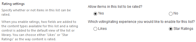
The SharePoint 2013 rating system slightly changed a bit. In SharePoint 2013 you can now choose to use likes or star ratings. This functionality can be turned on via the Rating settings in the list.
Styling the SharePoint 2013 star rating involves some work. The only “quick” option you have is to apply a composed look to your site. But applying a composed look to your sites means that every element will get a new look and feel. Depending on the type of site / project / changes, it could be that this isn’t the right option and would involve a lot more work.
But what options do you have to apply a different look to the star rating? In SharePoint 2010 you could update some properties in the property bag of the site, but this isn’t necessary anymore. The star rating is now client side rendered. That means that you’re able to modify it via JavaScript.
First of all, the star rating consists of the following images:
| RatingsSmallStarFilled.png |  |
| RatingsSmallStarEmpty.png |  |
| RatingsSmallStarLeftHalfFilled.png |  |
| RatingsSmallStarRightHalfFilled.png |  |
| RatingsSmallStarHoveroverEmpty.png |  |
| RatingsSmallStarHoveroverFilled.png |  |
| RatingsLargeStarFilled.png |  |
You will need to modify these images in order to match your own brand / style.
I found out that there are two different renderings of the star ratings:
- The list view star rating;
- The field star rating used on for example a page layout.
List View - star rating rendering
Note: this method can give conflicts if you have composed looks applied on your site.
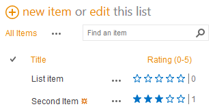
The default rendering of a star rating in a list view looks like this:
To apply your own star rating style to a list view you will need to add the following script to your master page.
_spPageContextInfo.themedImageFileNames = { "RatingsSmallStarFilled.png": "RatingsSmallStarFilled.png", "RatingsSmallStarEmpty.png": "RatingsSmallStarEmpty.png", "RatingsSmallStarLeftHalfFilled.png": "RatingsSmallStarLeftHalfFilled.png", "RatingsSmallStarRightHalfFilled.png": "RatingsSmallStarRightHalfFilled.png", "RatingsSmallStarHoveroverEmpty.png": "RatingsSmallStarHoveroverEmpty.png", "RatingsSmallStarHoveroverFilled.png": "RatingsSmallStarHoveroverFilled.png", "RatingsLargeStarFilled.png": "RatingsLargeStarFilled.png",};if (_spPageContextInfo.siteServerRelativeUrl === "/") { _spPageContextInfo.themedCssFolderUrl = "/Your-Image-Location";} else { _spPageContextInfo.themedCssFolderUrl = _spPageContextInfo.siteServerRelativeUrl + "/Your-Image-Location";}This is almost the same piece of code that a composed look applies to your site when it gets activated. The code makes SharePoint aware that there are different images to be used. In this example the names of the images stay unchanged (for the composed look the themed images are referenced).
The second part of the script is to let SharePoint know where your “theme” folder is located, so whenever the star ratings is rendered, it will reference the images of your location.
Important: this piece of code need to be added after the script manager element in your master page. If you place it somewhere towards the bottom of the master page, the star rating gets the default rendering, because the SharePoint JavaScript code already gets executed.
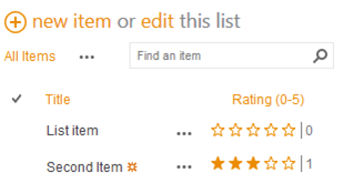
<asp:ScriptManager id="ScriptManager" runat="server" EnablePageMethods="false" EnablePartialRendering="true" EnableScriptGlobalization="false" EnableScriptLocalization="true"/>The result looks like this:
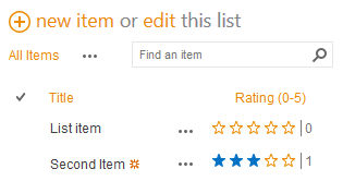
You only need to specify the images that you want or need to modify. For example if you don’t need to change the filled star image (RatingsSmallStarFilled), you can remove it from the array and your result looks like this:
Field Control - star rating rendering
When you applied a star rendering field control to a page layout, it will be rendered via JavaScript but with a slightly different approach then from the list view. The Field Control code is going to define all the necessary images in a hidden block. The JavaScript will reference the images that are defined in the hidden block.
<SPSWC:AverageRatingFieldControl FieldName="AverageRating" runat="server"></SPSWC:AverageRatingFieldControl>If you want to change the look and feel of the star rating, you can add your own hidden block with images to the master page. Each image should have the ID value corresponding to the default image.
The hidden block should look like this:
<div style="display:none;"> <img src="/Your-Image-Location/RatingsSmallStarEmpty.png" id="RatingsSmallStarEmpty.png" /> <img src="/Your-Image-Location/RatingsSmallStarFilled.png" id="RatingsSmallStarFilled.png" /> <img src="/Your-Image-Location/RatingsSmallStarLeftHalfFilled.png" id="RatingsSmallStarLeftHalfFilled.png" /> <img src="/Your-Image-Location/RatingsLargeStarFilled.png" id="RatingsLargeStarFilled.png" /> <img src="/Your-Image-Location/RatingsSmallStarRightHalfFilled.png" id="RatingsSmallStarRightHalfFilled.png" /> <img src="/Your-Image-Location/RatingsSmallStarHoveroverEmpty.png" id="RatingsSmallStarHoveroverEmpty.png" /> <img src="/Your-Image-Location/RatingsSmallStarHoveroverFilled.png" id="RatingsSmallStarHoveroverFilled.png" /></div>Best is to place this block as close as possible to the body opening tag in your master page. The image ID’s need to have the values of the default images.
The rendering looks like this of the field looks like this:

When you don’t need to use a particular image, you could leave out that image from the hidden block on your master page.

Related articles
Search Hover Panel Positioning Bug in non IE Browsers (SharePoint 2013)
Part 2: Adding Refinement Actions to the Custom Search Refiner Control
Part 1: Create Your First Search Refiner Control Template
Report issues or make changes on GitHub
Found a typo or issue in this article? Visit the GitHub repository to make changes or submit a bug report.
Comments

Let's build together
Manage content in VS Code
Present from VS Code
Engage with your audience throughout the event lifecycle